
Vertical institute ux bootcamp capstone project
Redesigning of DBS Digibank App

Have you ever find yourself clenching your teeth as you struggled using any iBanking app? Well, you are certainly not alone.
DBS, being one of the more popular bank in Singapore, aims to provide sophisticated banking experiences for it's customers. Hence, the DBS digibank app offers a range of services to cater to different customers' needs.
But, let's think further about it.
How does receiving instant push notification upon receiving money sounds to you?
How about automate payment that occurs regularly such as monthly bills?
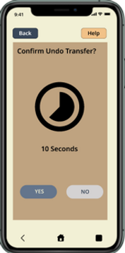
Ever wished to undo transaction that you have mistakenly sent to the wrong person?
Or did anyone had to wait for you to guide them so that the transactions could proceed on?
If you said 'Yes' to any of the above, I sure did too, and that's the purpose of my capstone project. To redesign the DBS digibank app to promote sophisticated banking experience through empowering it's end users with actions that is relevant and personalized to them.
Low fidelity
The Crazy 8's
The Crazy 8's, generates creativity as one can throw in any 8 unique idea that they wishes or hoped to see for the products/services in 8 minutes time. The ideas are generated based on "How might we..." statement.
For example, "How might we allow easier process for repeating transactions?". This made me thought of implementation of having recurring transactions.

Mid fidelity
Sitemap (Miro)
Prototype (Miro)
After wearing different personas' hats, the following sitemap are generated through "how might we" statements and filtered through the MoSCow method.
The sitemap will act as a guide that gives the designers a rough idea on the functions, navigations and clickable areas within the prototype. In this case, the users should be given the option to recur transactions or undo transactions within a specific of time.

Recommended mockup: Apple iPhone
Reason: Enhance web design; To spot and rectify issue as soon as possible


high fidelity prototype
Figma
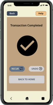
High Fidelity Prototype presents the most realistic user interactions by providing all functions for users to interact with.
In this case, I choose a series of actions where users can complete transactions with the options to recur or undo the transactions.


Usability Testing
To understand the users' thinking on the prototype, I conducted a quick interview with my group of 5 friends upon meetup.
Strengths
Functions are more relevant:
- Help buttons are easy to find and use;
- Feels more empowered to use the app with the ability to recur and undo transactions
Well-designed:
- Process were simple and smooth
- Texts and colours were well-coordinated
Flaws
Security:
- Upon using voice assistance, will the account balance be read-out loud?
Notification:
- Any notification informing users before the actual recur transaction takes place?
The end
With the flaws kept in mind, this project needs to run through a number of iterations to continue refine the process within the system.
Taking the user-centric approach means that soliciting users' feedbacks are essential in creating designs that provide sophisticated user-experience.
18 / 12 / 2021